
Tech
What Are Dark Patterns? India Just Fined Zepto, BookMyShow, and More for Using Them
On August 5th, 2026, India's government confirmed in the Rajya Sabha that 9 major apps, including Zepto, BookMyShow, IndiGo, and Physics Wallah, were collectively fined nearly Rs. 20 lakh for using dark patterns. These are manipulative UI and UX design tricks built into apps to push you into decisions you never actually meant to make.
This is not just a consumer issue. Since November 2023, all 13 categories are officially illegal in India under the CCPA Guidelines on Dark Patterns. If you use any of them in your product, you are exposed to real legal risk. And as of 2026, enforcement is actually happening.
I covered this in my YouTube video and broke it across four LinkedIn carousels. This post is the complete written version with every pattern explained and examples you will recognise immediately.
What Are Dark Patterns?
A dark pattern is any UI or UX design choice that deliberately works against the user's interest. The term was coined by UX designer Harry Brignull in 2010, but the practice is as old as sales itself. Apps just made it faster, cheaper, and invisible at scale.
The key word is "deliberately." These are not design mistakes. Someone tested them, measured the conversion lift, and kept them. The checkout button is big and bright. The cancel option is buried five menus deep. That is not a coincidence.
India's Central Consumer Protection Authority recognised 13 specific categories under the Consumer Protection Act, 2019. Companies that use them can face fines and regulatory action, and as of August 2026, that consequence is real and not just theoretical.
Are Dark Patterns Illegal in India?
Yes. Since November 2023, the CCPA Guidelines classify all 13 dark pattern categories as unfair trade practices under the Consumer Protection Act, 2019.
The August 2026 Rajya Sabha disclosure confirmed that 9 companies had already been fined, including Zepto, BookMyShow, IndiGo, and Physics Wallah, totalling nearly Rs. 20 lakh. This was reported by NDTV and Outlook Business.
If your product uses any of the 13 patterns below, you are not in a grey area. You are in violation.
All 13 Dark Patterns Recognised by India's CCPA
1. Drip Pricing
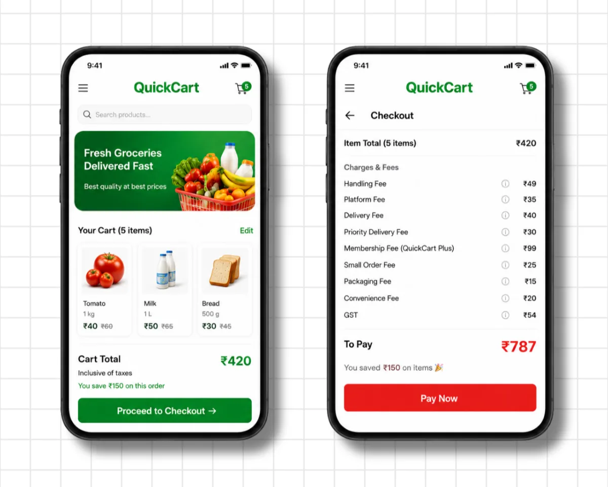
Drip pricing is when extra fees get added one by one during checkout, so the total you actually pay is far higher than the price you saw on the listing.
A cart shows Rs. 420. You tap "Proceed to Checkout." Suddenly there is a handling fee, a platform fee, a delivery fee, a priority delivery fee, a membership fee you never signed up for, and GST on top of all of it. You end up paying Rs. 787. The Rs. 420 was the hook. Rs. 787 was always the real number.
2. Basket Sneaking
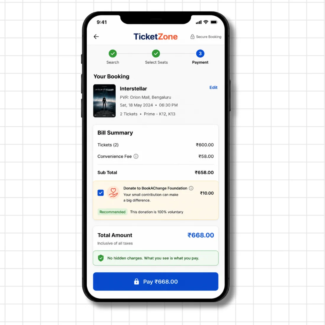
Basket sneaking is when something gets added to your cart without you choosing it. Usually a donation or an add-on, pre-selected by default, sitting quietly in your bill summary.
You are booking movie tickets. Everything looks fine. Then right before payment, there is a Rs. 10 donation to a foundation, already ticked. It even says "this donation is 100% voluntary." Voluntarily pre-ticked is still pre-ticked. Most people miss it because they are not looking for it. That is the entire design.
3. Bait and Switch
Bait and switch is when an app advertises one price or product, then changes it by the time you reach checkout.
You see a plan at Rs. 999. You go through the whole signup flow. At checkout, it is suddenly Rs. 1,999. Or the Rs. 999 option has quietly disappeared. You are already invested in the process. The friction of starting over is the leverage they are using against you.
4. Confirm Shaming
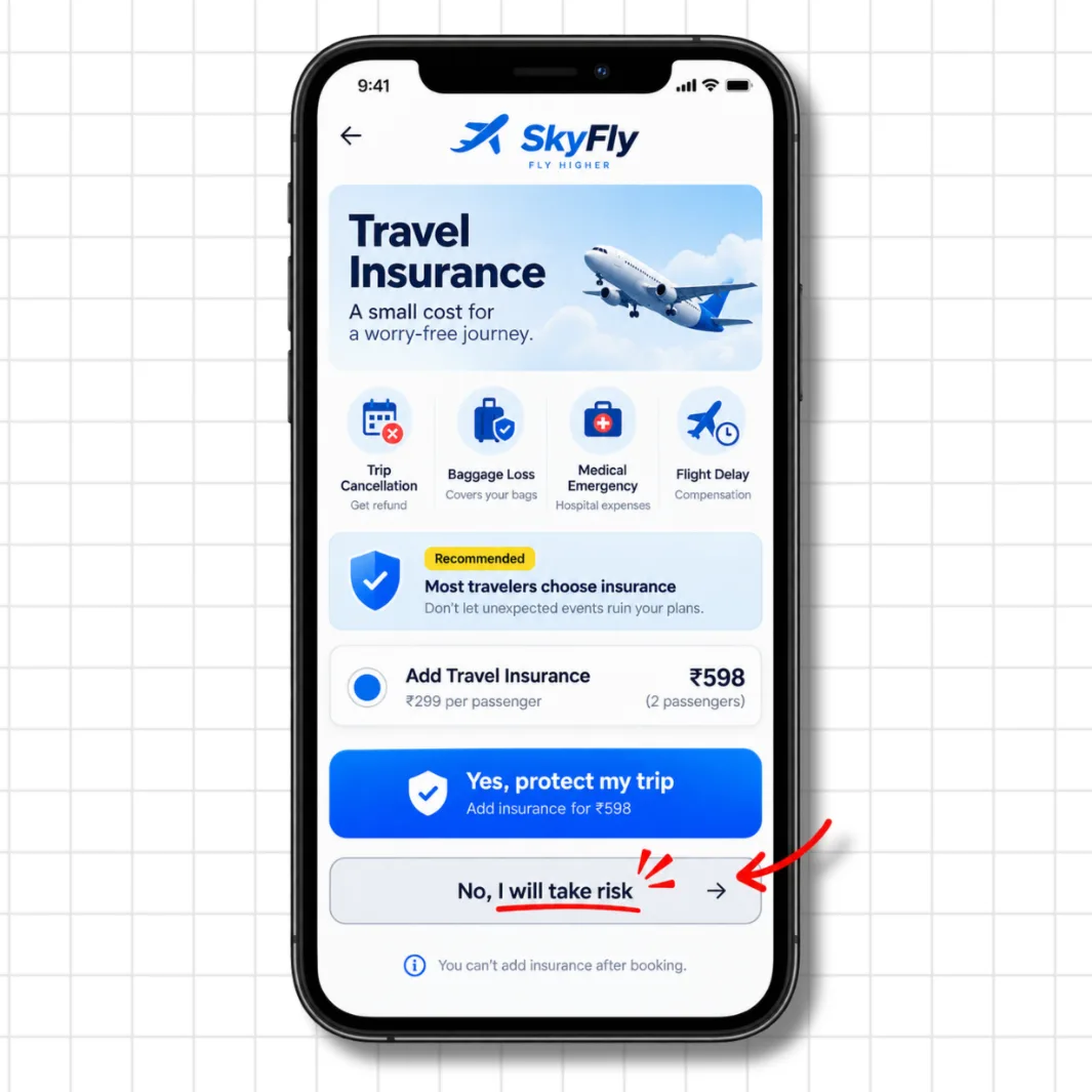
Confirm shaming is when the "no" option on a popup is written to make you feel guilty or reckless for declining, instead of giving you a neutral choice.
A travel app shows you a travel insurance upsell. The accept button says "Yes, protect my trip." The decline button says "No, I will take risk." That is not a neutral option. It is designed to make you doubt a completely reasonable decision. Most people tap yes just to stop feeling that small pang of worry. That pang was engineered.
5. Nagging
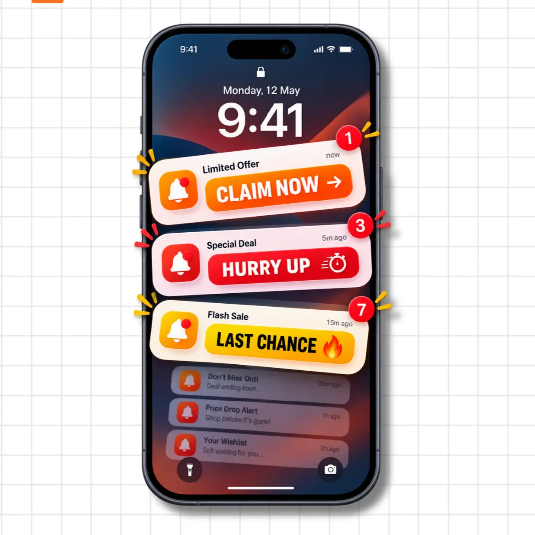
Nagging is when an app sends the same message repeatedly, not to give you new information, but purely to wear you down through repetition until you give in.
"Claim Now." "Hurry Up." "Last Chance." Same notification, every 15 minutes. The goal is not persuasion. It is exhaustion. You tap "buy" just to make the notifications stop. That is not a free decision. That is coercion through persistence.
6. False Urgency
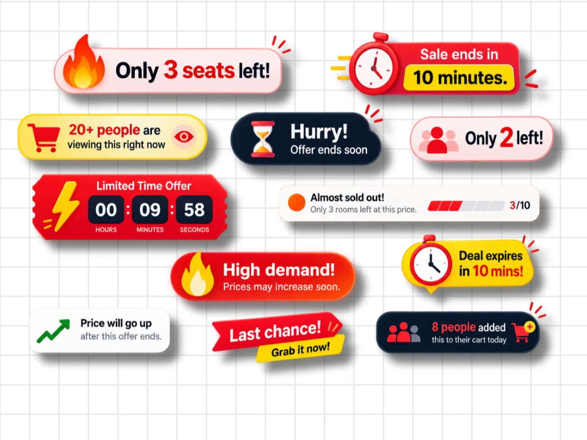
False urgency is when an app creates artificial scarcity or fake countdown timers to rush you into buying before you have had time to think clearly.
Here is a quick test: find a product with a countdown timer. Note the remaining time. Refresh the page. If the timer resets, the urgency was never real. "Only 3 seats left" on inventory that is always in stock. "20 people are viewing this right now." "Sale ends in 10 minutes" that starts fresh on every visit. All of it is theatre designed to trigger panic-buying.
7. Interface Interference
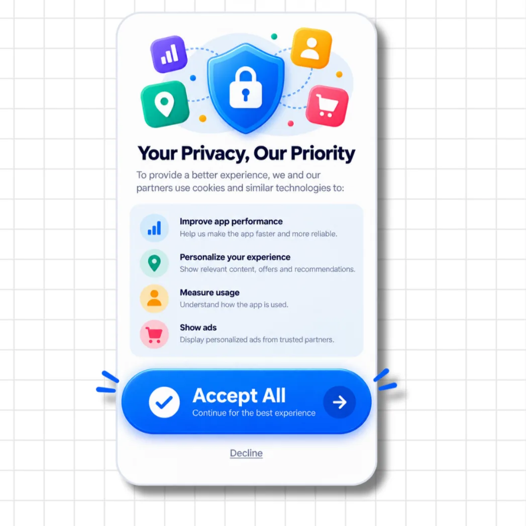
Interface interference is when the visual design itself steers you toward one choice by making the alternative visually difficult to find or interact with.
The most common version: a cookie consent popup where "Accept All" is a large bright blue button filling the screen, and "Decline" is small grey underlined text sitting quietly underneath it. Both options technically exist. But one of them is designed to be almost invisible. Your eyes go to the button. You tap it. You never even noticed the other choice was there.
8. Disguised Advertisement
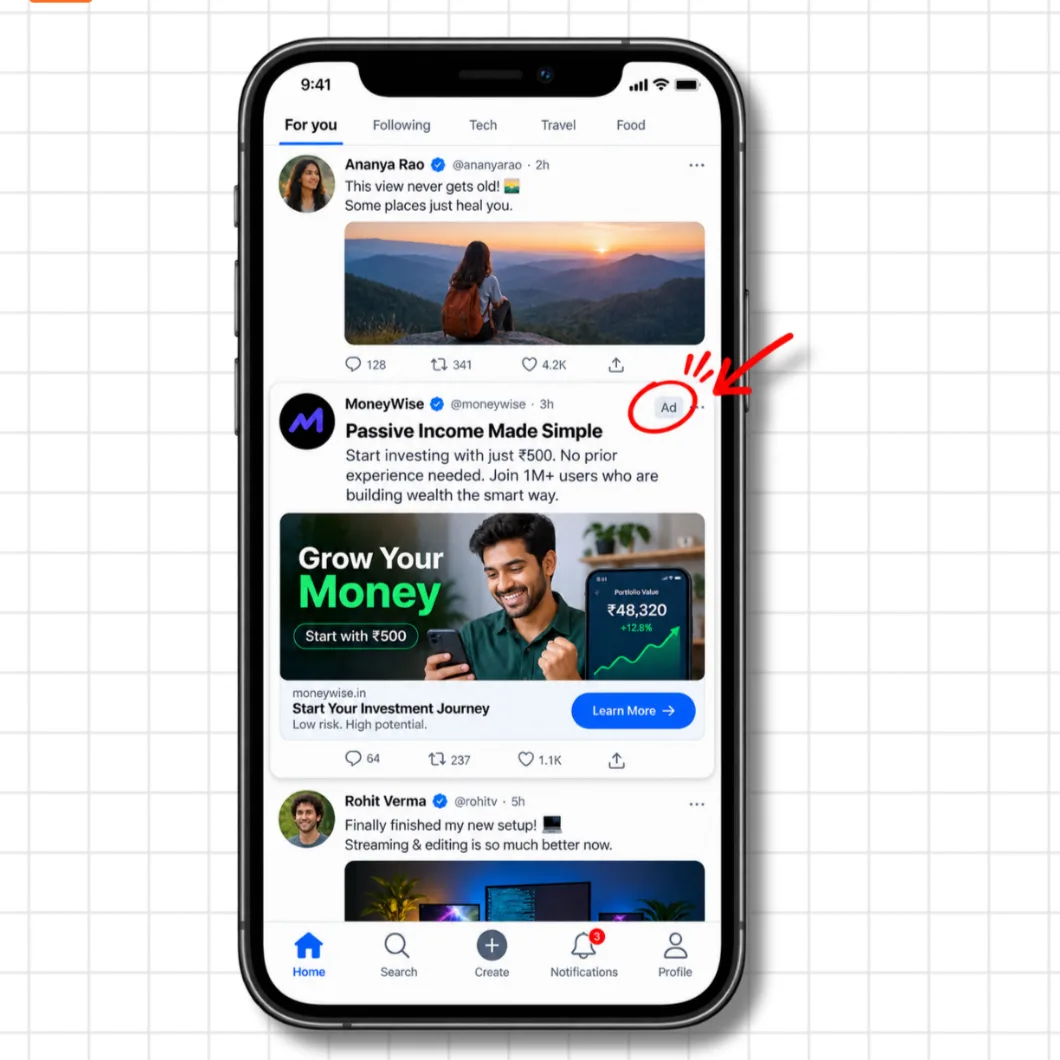
A disguised ad is a paid promotion styled to look exactly like organic content in your feed, so you engage with it thinking it is a regular post from someone you follow.
You are scrolling. You see what looks like a normal post. You read it, maybe even interact with it. Then you spot a tiny "Ad" label tucked in the corner with low contrast, easy to miss at scrolling speed. The whole point was to earn that read and that engagement without you knowing it was bought.
9. Trick Question
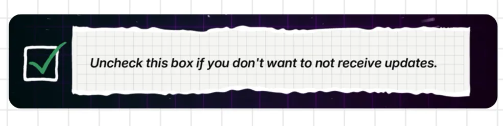
A trick question uses double-negative or deliberately confusing wording in a checkbox so that you end up doing the opposite of what you intended.
"Uncheck this box if you don't want to not receive updates."
Read that again. Most people hit a wall parsing that sentence, give up, and leave the box as it is. Which means they are opted in, even though they wanted to opt out. The confusion is not accidental. It is the feature.
10. Forced Action
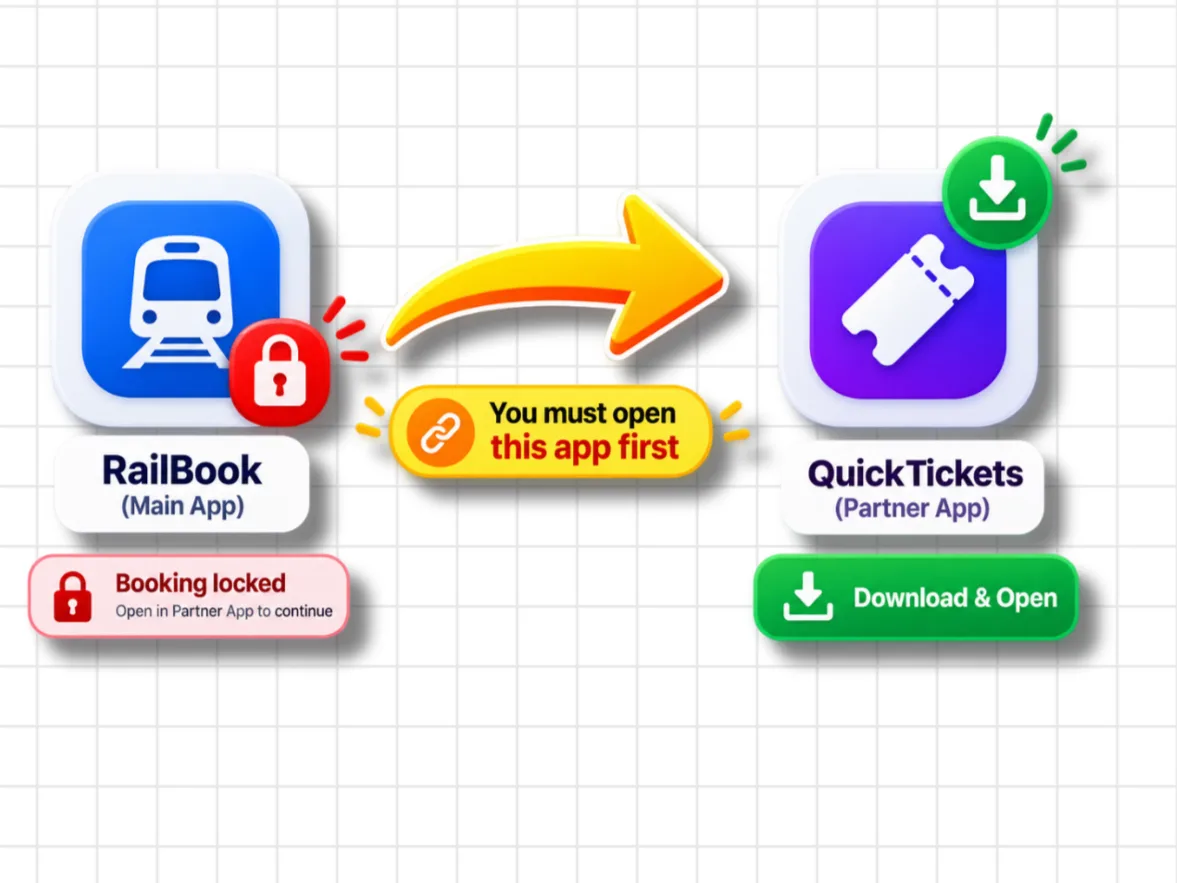
Forced action is when you are made to complete an unrelated task, like downloading a separate app or creating an account with a third-party service, just to finish something you were already doing in the app you opened.
You book a train ticket. The booking goes through. Then: "Your ticket is locked. Open our partner app to continue." You never agreed to a second download. You never planned for it. But your ticket is sitting there and the only path forward is to comply. So you download it. That app now has your data.
11. Subscription Trap
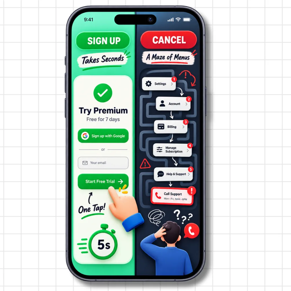
The subscription trap makes signing up take one tap and cancelling take a maze of menus, a support call, or a wait on hold during business hours.
"Try Premium, free for 7 days." One tap. Seven days later, you are billed. You try to cancel: Settings, then Account, then Billing, then Manage Subscription, then... "Please call support, Monday to Friday, 9AM to 6PM." The asymmetry is entirely by design. Every day you do not cancel is another billing cycle they capture.
12. SaaS Billing
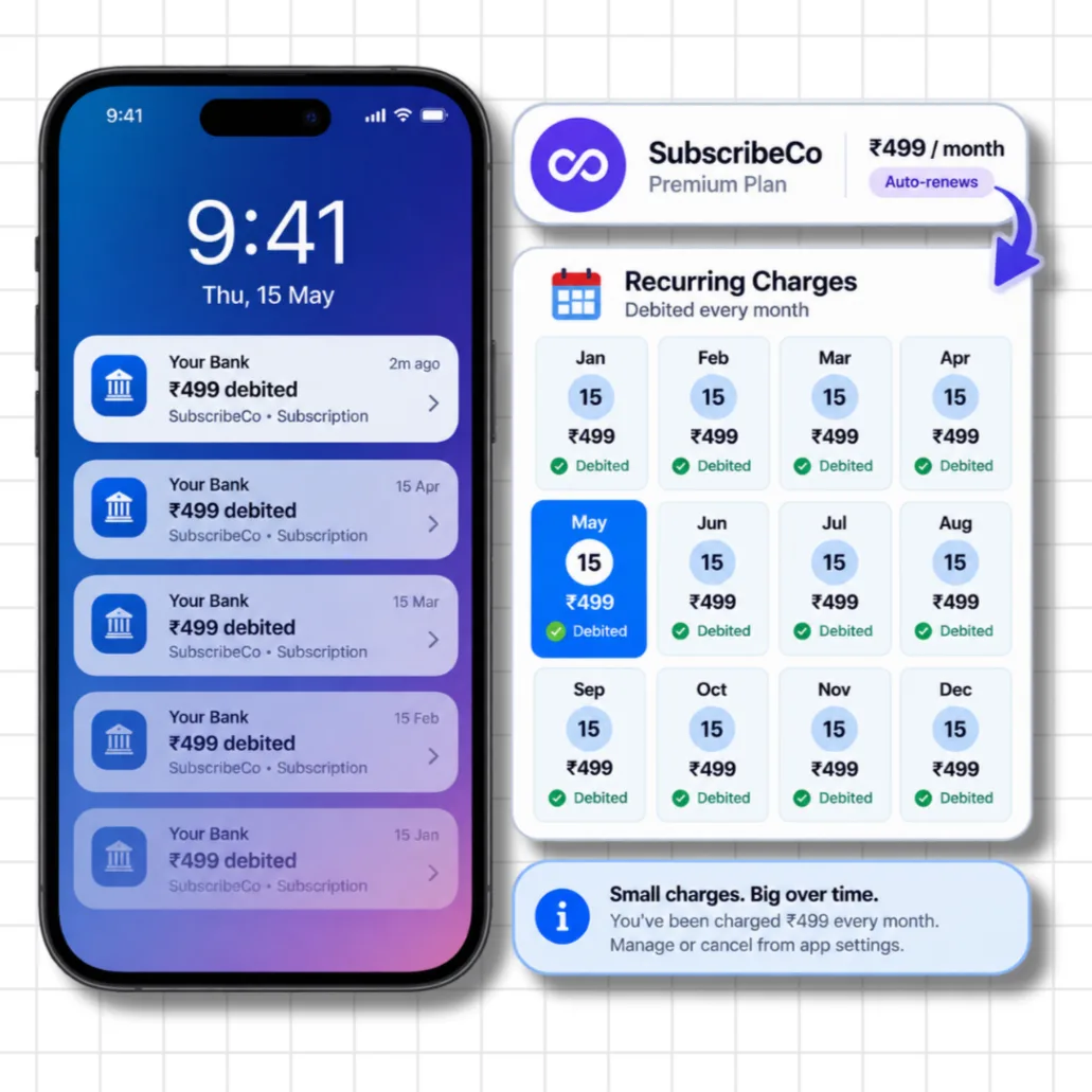
SaaS billing, sometimes called silent billing, is when small recurring charges with vague descriptions keep getting debited every month. Small enough each time that most people never notice until they sit down and actually audit their statements.
Rs. 499 per month. Same date, every month. Generic description on the bank statement. You signed up months ago and forgot. Over 12 months, that is nearly Rs. 6,000 drained quietly. The small denomination and the vague label are both intentional.
13. Scareware
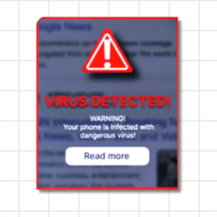
Scareware is fear used as a UI element. A fake "your device is infected" popup designed to make you panic and tap something immediately, without thinking. Whatever you tap is the trap.
A red alert fills your screen: "VIRUS DETECTED! Your phone is infected with a dangerous virus!" There is a "Read more" button. You tap it because you are scared and want to fix it fast. That tap installs actual malware, takes you to a payment page for fake antivirus software, or harvests your device data. The alarm was fake. Your click was the target all along.
Which Indian Apps Were Fined for Dark Patterns?
According to NDTV and Outlook Business, the Rajya Sabha disclosure on August 5th, 2026 confirmed that the fined companies include Zepto, BookMyShow, IndiGo, and Physics Wallah, among others. The total fines came to nearly Rs. 20 lakh collectively.
This is the first major public confirmation that India's CCPA Guidelines, introduced in November 2023, are being actively enforced and not just documented on paper.
What Developers Need to Know
If you are building a product in India, these 13 patterns are not just bad UX. They are legal liability with real consequences.
A practical checklist:
- Your cancel flow should be as easy to find as your signup flow
- Show the total price upfront, with all fees included, not just at the final checkout step
- Any checkbox that defaults to opted-in needs to be reconsidered
- Countdown timers must reflect real constraints, not manufactured ones
- The "no" button should just say no
Good products do not need to trick people into using them. And beyond the legal angle, there is a simpler business truth: trust is what keeps users coming back. Every dark pattern is a short-term conversion win and a long-term trust deficit.
FAQ
What are dark patterns in UX?
Dark patterns are deliberate UI and UX design choices that manipulate users into taking actions they did not intend, like agreeing to a subscription, paying hidden fees, or sharing extra data. They are not design mistakes. They are tested and kept because they improve a metric the company cares about, usually at the user's expense.
Are dark patterns illegal in India?
Yes. Since November 2023, the CCPA Guidelines classify 13 categories of dark patterns as unfair trade practices under India's Consumer Protection Act, 2019. Companies that use them can be fined and face regulatory action.
Which apps in India were fined for dark patterns?
As reported by NDTV and Outlook Business, the Rajya Sabha disclosure on August 5th, 2026 confirmed that Zepto, BookMyShow, IndiGo, Physics Wallah, and several other companies were collectively fined nearly Rs. 20 lakh for using dark patterns.
What is the most common dark pattern in Indian apps?
Drip pricing and subscription traps are among the most widespread. Drip pricing is especially common in food delivery and e-commerce apps, where the listed price looks very different from the checkout total. Subscription traps are common across OTT platforms and SaaS products.
How do I spot a dark pattern when I see one?
Slow down whenever you see a countdown timer, a pre-ticked checkbox, or a large accept button next to a tiny grey decline option. If the "no" button is worded to make you feel guilty, that is confirm shaming. If your checkout total is higher than what was listed, that is drip pricing. The common thread: the interface is working against you, not for you.
What is the difference between dark patterns and bad UX?
Bad UX is unintentional friction that happens because of poor design decisions. Dark patterns are intentional. They are tested, measured, and kept because they increase the metric the company cares about, directly at the cost of user trust and informed consent.
The Takeaway
Most dark patterns work because we move fast and assume apps are designed in good faith. That assumption is worth questioning regularly.
The CCPA fines signal that India's regulatory environment is shifting from guidelines on paper to real enforcement. But the more lasting change is user awareness. Once you can name a pattern, it loses most of its power. The next time a checkout screen surprises you, or a button asks you to confirm that you "want to take the risk," you will know exactly what you are looking at.
Watch the full video breakdown here: Zepto, BookMyShow, PW Fined for This